In the world of tourism, visual identity is more than just a symbol: it is the tangible representation of its spirit, its values, and the commitment to the travelers who visit us. At Paramo Trek, we have witnessed the constant evolution of our surroundings and embarked on an exciting journey towards redefining our identity.
Our journey began with a clear vision: we wanted to elevate the mountain experience, making it more professional and safe for our travelers, always hand in hand with the local communities. From the first steps of our adventure, we recognized that it is in the mountains where our physical, mental, and spiritual limits are revealed and challenged. We wanted to seize this experience as an opportunity to help our travelers overcome those limits and deepen their connection with nature and themselves, while protecting and preserving the natural environment we visit.
Our mission goes beyond simply taking our travelers to the highest trails and peaks; we also strive to promote companionship, teamwork, and respect for the surrounding nature. Additionally, we seek to educate about the unique ecosystems we visit. We consider local communities as key players in our mission, as we work closely with them to promote sustainable development and greater safety in the mountains through donations that benefit this purpose.
This is how Paramo Trek was born, with its old logo featuring the iconic representation of the Nevado del Tolima, symbolizing our dedication to the mountains and our commitment over a decade. Additionally, we adopted the slogan “Keep hiking, Keep living”, which not only reflects a passion for hiking but also for feeling alive and connected to our environment. However, over time, we have experienced significant changes in our focus, values, and vision for the future. We now find ourselves in an era marked by sustainability and connection to our environment.
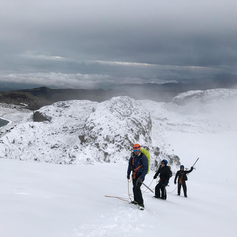
We recognized the need for an image that not only reflected our passion for the mountains but also our fundamental values of unity, integrity, and sustainability. Therefore, a deep reflection began on who we are and what values guide us. For years, we have been passionately dedicated to ecotourism in high and mid-mountain areas, exploring the most remote and challenging corners of the Los Nevados National Natural Park. We discovered that our integrity and unity have made us a resilient team. Throughout our journey, we have faced various challenges such as a global pandemic, but thanks to the unity among our administrative team, our guides, and the support of our community of travelers, we have overcome them. Now, we look to the future with optimism and determination.
This is how the idea of adopting a new symbol was born: we were inspired by the eight-type descender, an essential tool in climbing and a powerful reminder of the importance of unity among peers. At Paramo Trek, we firmly believe in “Cordada sin limites” or “Roped team without limits”, an internal motto that transcends the mountains and becomes a mantra that guides our actions in every aspect of our adventure. Like a united rope team at high altitudes, we are committed to always standing by our colleagues and travelers, who become family as the days go by. Our strength lies in our unity, our shared goals, and the resilience that drives us not to feel limited in our journey. This new logo is the perfect symbol of our unwavering commitment.
The inclusion of the Lupinus flower, in a vibrant orange tone on the sides of the logo, adds an additional layer of meaning. These flowers, found in the páramos and forests of Colombia, are not only beautiful in their simplicity but also play a vital role in the ecosystem as mother flowers for new species. Like the Lupinus flowers, we strive to be facilitators of growth and restoration. At Paramo Trek, we dream of being an incubator of projects that strengthen local communities and the natural environments we visit, as a form of retribution for the work we do. This commitment is reflected in our actions, as we have undertaken projects that benefit the community and soon the natural environments that we explore and enjoy with our travelers.
In summary, the change in our logo is not simply an aesthetic exercise but an authentic reflection of our evolution as a company and as a community. We are excited to embark on this new chapter in our history, carrying with us our values, our passion, and our commitment to a future full of expectations.
Join us on this exciting journey and be part of a community committed to tourism, authentic adventure, and the care of our natural environment.

